
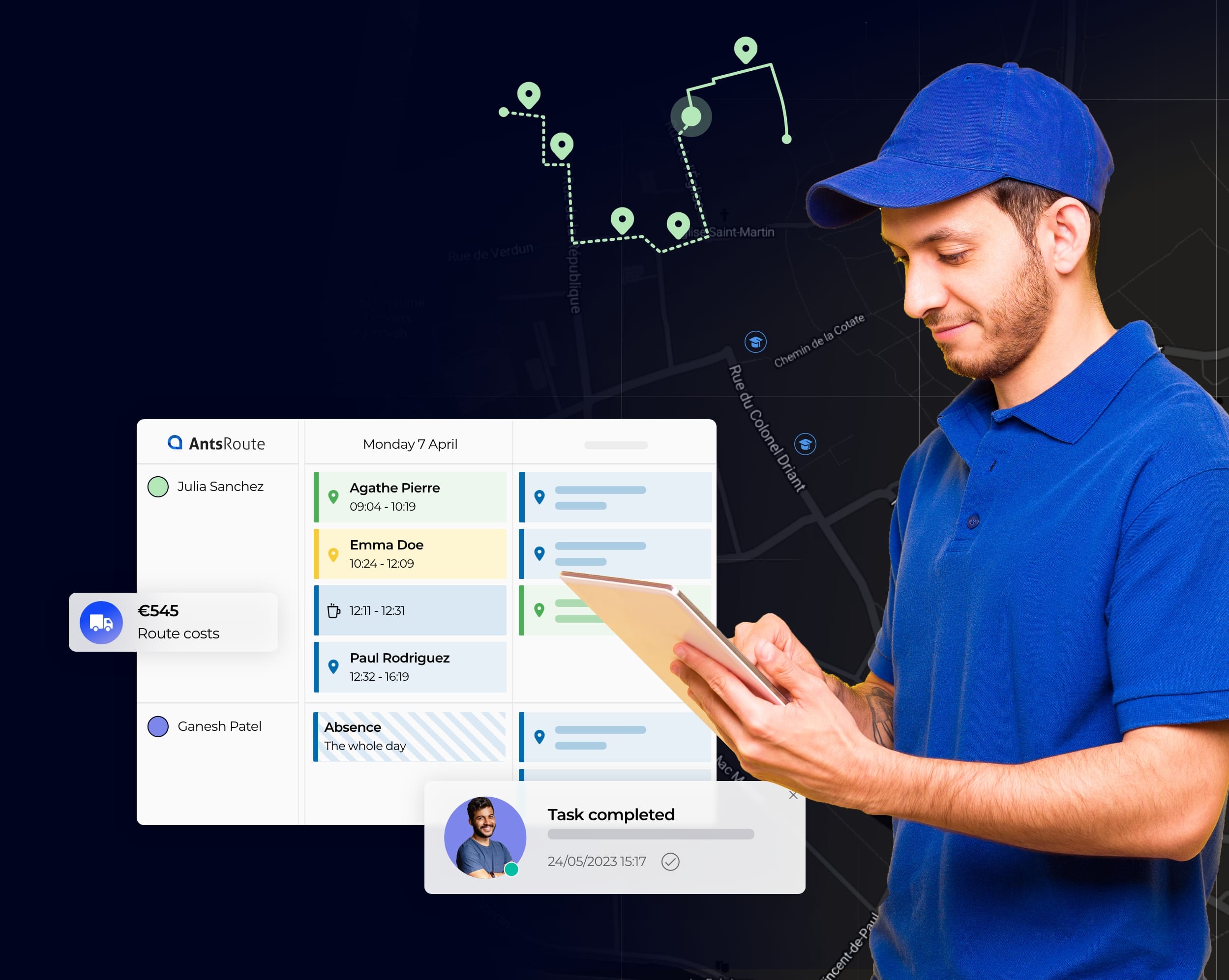
The route planning software to optimise the last-mile
Improve your productivity, make the day-to-day work of your field staff easier and provide a 5-star experience to your customers with our SaaS route management and optimisation platform.
- Route optimisation in few seconds
- Live tracking of field workers
- Automated transmission of service reports
ADOPTED BY +3,000 FIELD WORKERS AND DELIVERY DRIVERS WORLDWIDE
![]()
![]()

![]()
![]()
Delivery
Boost your productivity and make everyday work easier for your delivery drivers with our innovative SaaS delivery management platform.
Field service
Scale your business and simplify the day-to-day work of your field technicians with our easy-to-use service management software.
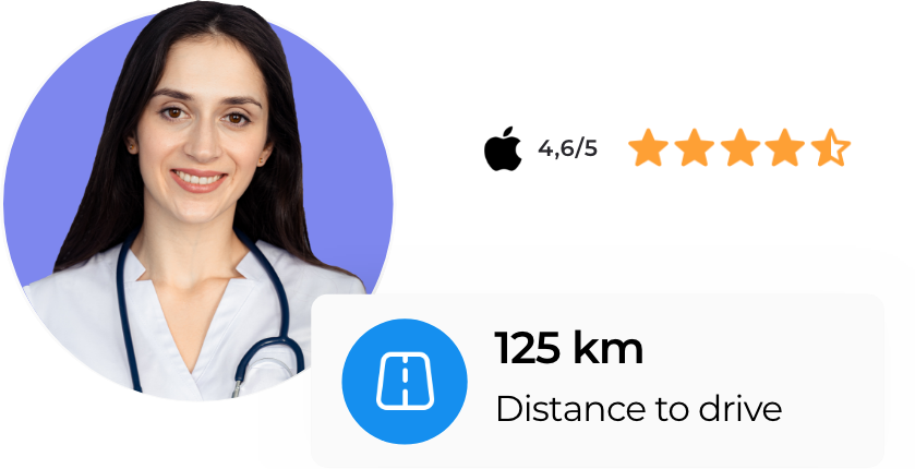
Healthcare
Make it easier to organise your operations and the day-to-day work of mobile caregivers with our SaaS home care management software.

Customer loyalty
Offer the best experience by meeting the deadlines and ensuring excellent communication.

Last mile sustainability
Lower the carbon emissions of your vehicle fleet by limiting empty truck trips.

Worker satisfaction
Improve the working conditions of your field staff with feasible and balanced routes.

Business profitability
Improve the productivity of your field workers by reducing driving times by 20% between two steps.
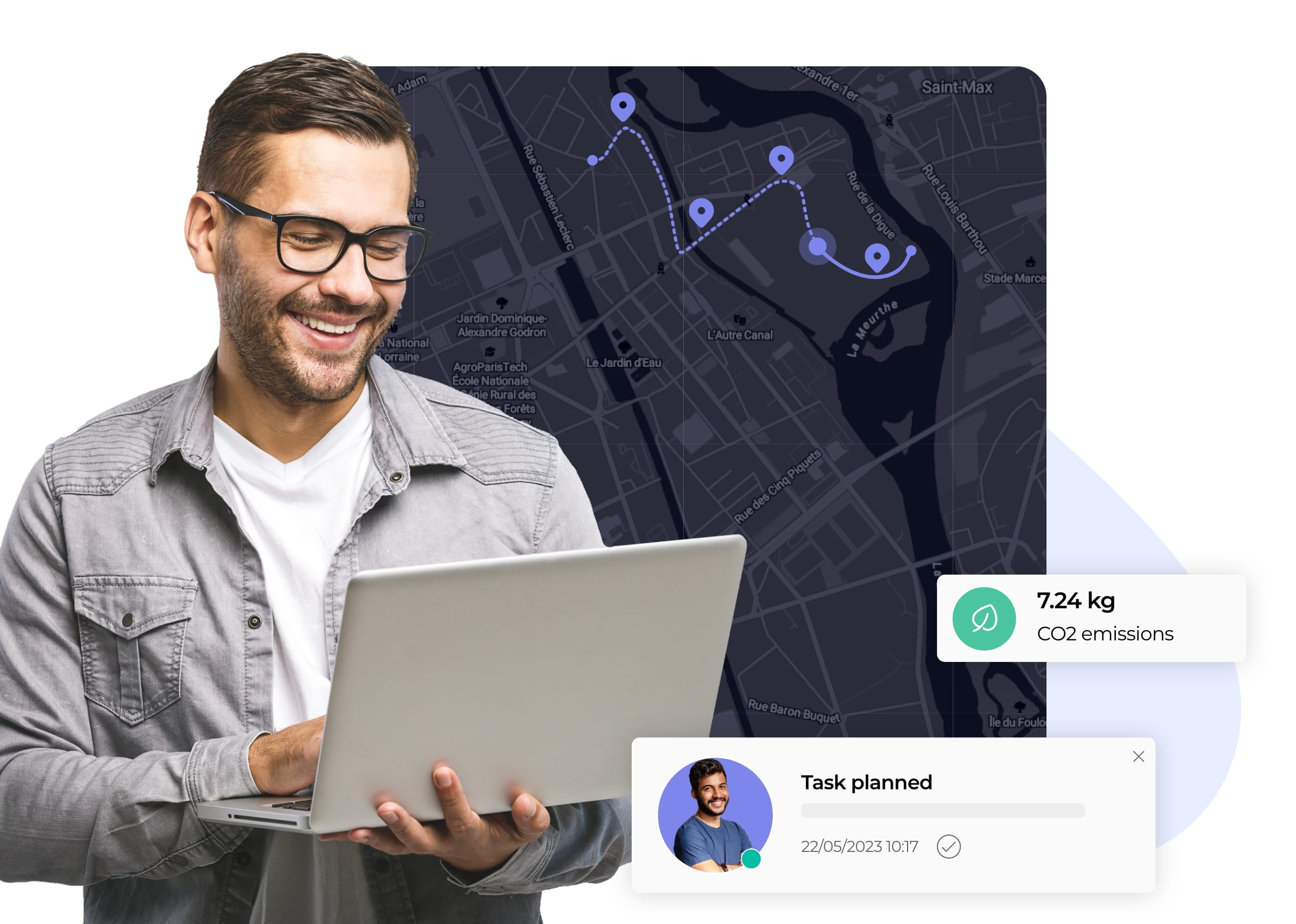
Easily organise your routes
Provide your operations manager or schedulers with a unique interface to organise the routes of your field workers in the best possible way.
- Scheduling of operations
- Optimisation of routes
- Live tracking of drivers
- Analysis of performance
- Scheduling of tasks
- Optimisation of routes
- Live tracking of drivers
- Analysis of performance
3000+
Daily routes
300+
Customers
5+
Available languages
10+
Countries of customers
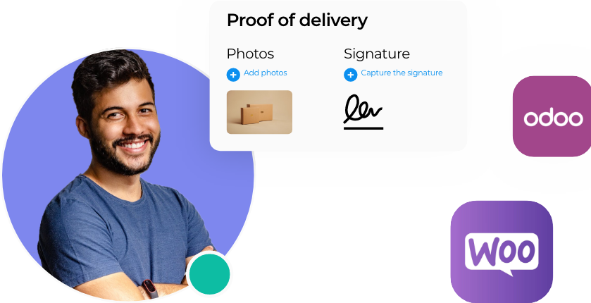
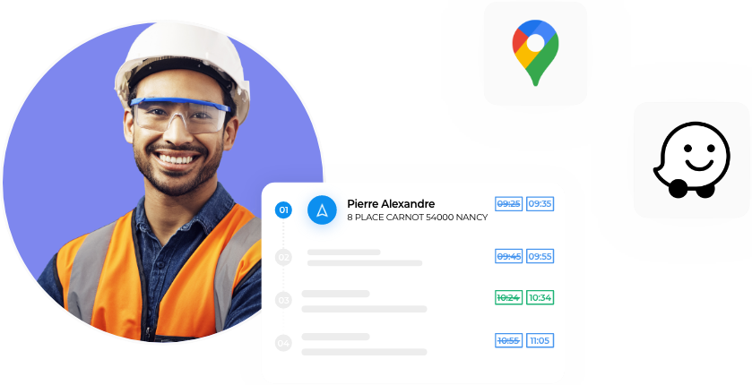
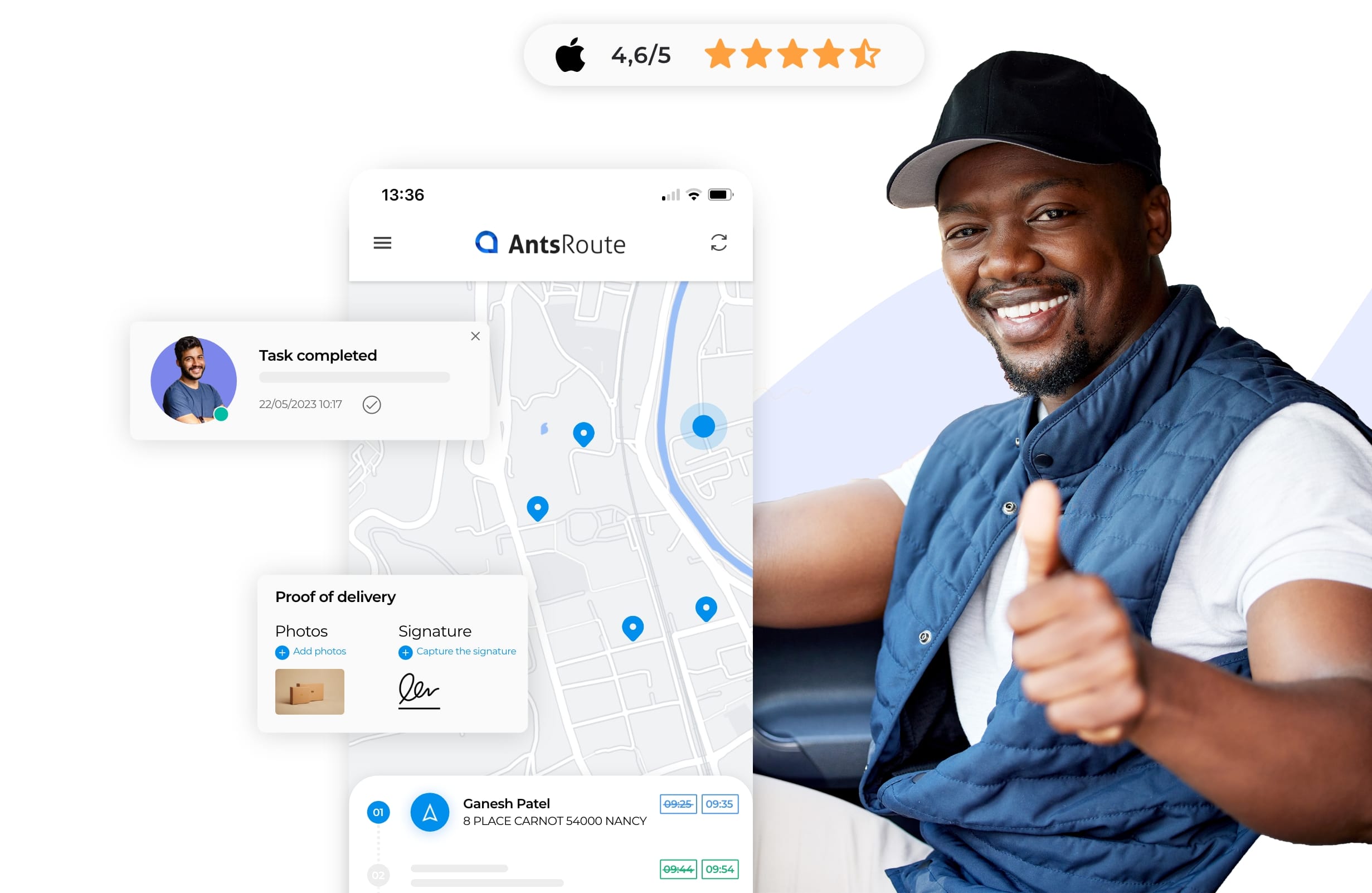
Support your field workers
Make the day-to-day work of your drivers easier with optimised routes available on the Android and iOS AntsRoute mobile application. Thanks to the application, offering offline mode, you can improve the autonomy of your workers and keep complete overview of your operations in the field.
- Paperless route plans
- Waze or Google Maps navigation
- Geolocation of workforce
- Calculation of actual time on site
- Transmission of proof of service
- Planning from the mobile app.
- Paperless route plans
- Waze or Google Maps navigation
- Geolocation of workforce
- Calculation of actual time on site
- Transmission of proof of service
- Planning from the mobile app.
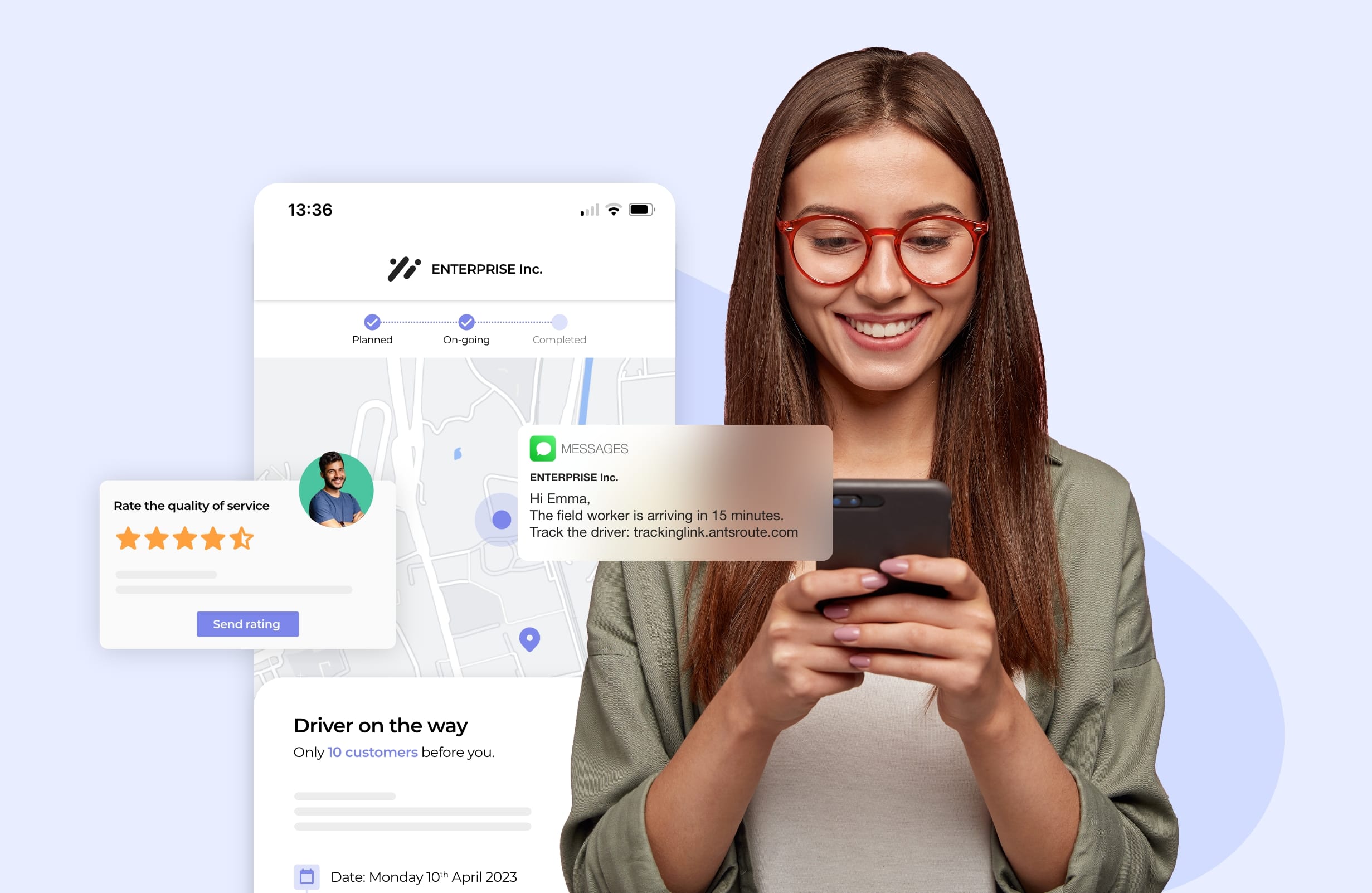
Offer your customers a 5-star experience
Retain your customers by offering them the best experience possible. You ensure better respect of the scheduled times and send real time information at each stage to help customers plan around the delivery or visit.
- SMS or email notifications
- 24/7 appointment booking site
- Confirming or rescheduling link
- Geotracking of orders
- Sending of work reports
- Rating the quality of services
- SMS or email notifications
- 24/7 appointment booking site
- Confirming or rescheduling link
- Geotracking of orders
- Sending of work reports
- Rating the quality of services
Integrate your favourite apps
If you already have a CRM or ERP system to manage your orders, customers or invoicing, use our API to connect these systems to your AntsRoute account. You can also benefit from our integrations with many other applications.
AntsRoute customers find it very easy to implement
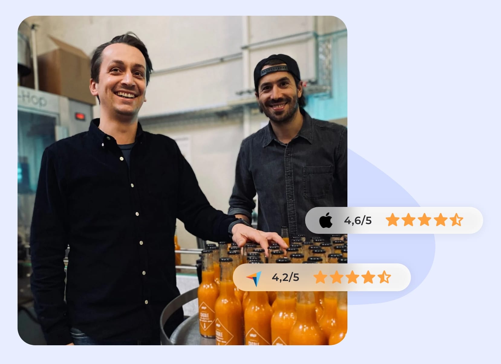
The algorithm finds solutions that I would not necessarily have considered, and which take into account the constraints set by the clients. The human brain tends to think that it will find the best option, but this is rarely the case. The algorithm is much more right than the human!
Sébastien Specht
Co-founder of La Boissonnerie de Paris
Start the optimisation of your routes
Free 7-day trial | No credit card required